MOSS STUDIO

Web design · UX/UI · Webflow development

Cyrclo: A digital platform for marketing that scales

Cyrclo connects intelligent analytics, automation and data-led strategy. We translated that complex offer into a clear digital experience that makes the technology understandable, builds trust and can grow with the product.
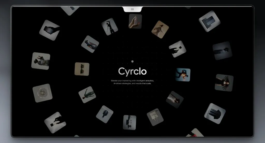
  • Cyrclo AI marketing website with floating visual cards on a dark background
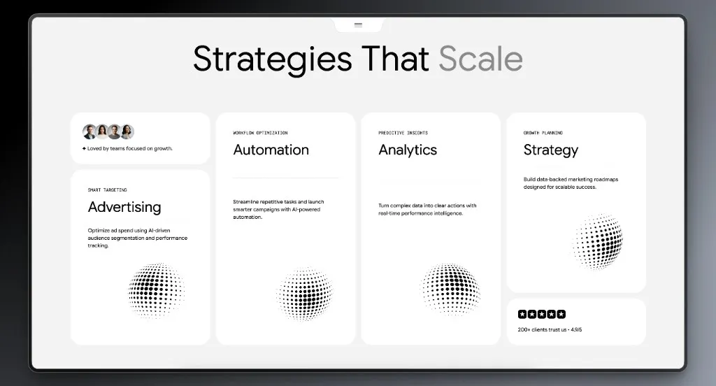
  • Cyrclo service overview with cards for Advertising, Automation, Analytics and Strategy
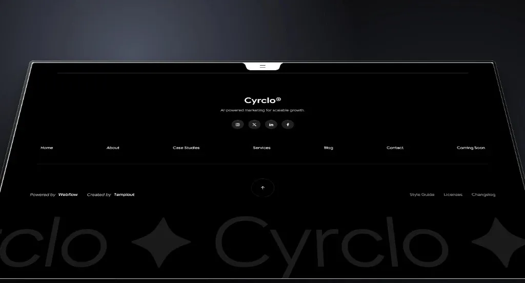
  • Cyrclo website footer with navigation, social links and a large wordmark
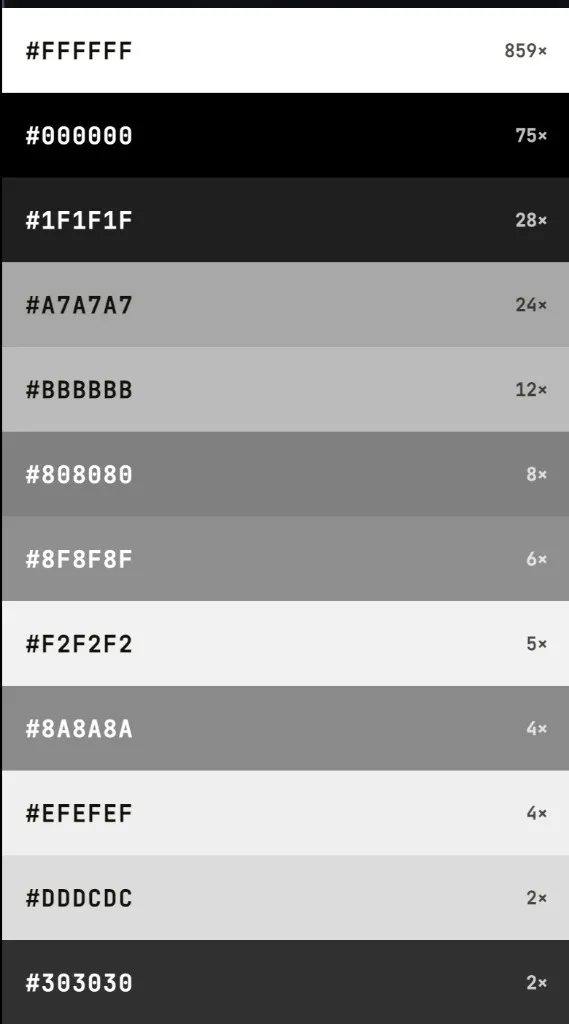
  • Monochrome Cyrclo colour palette with black, white and stepped greys
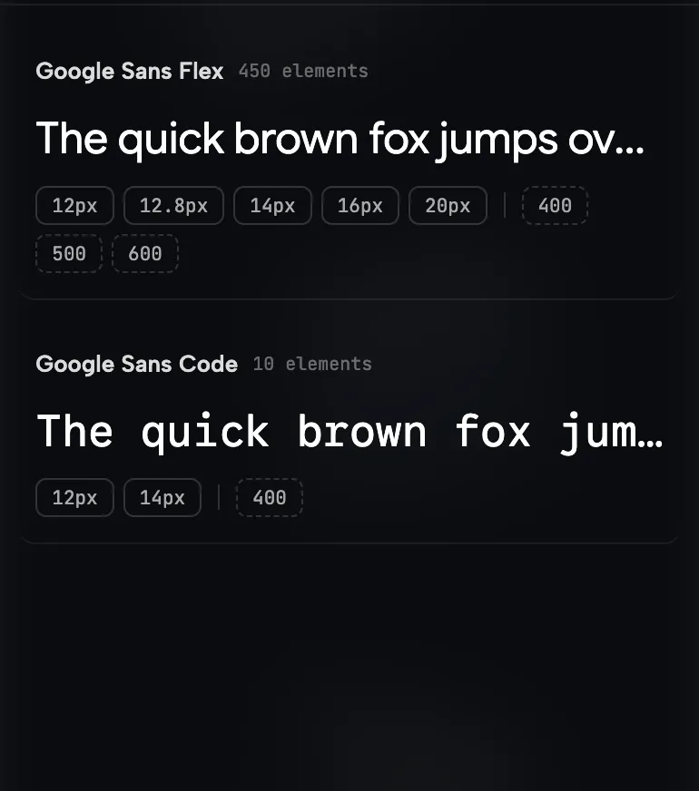
  • Cyrclo type system with Google Sans Flex and Google Sans Code

A reduced opening that ties technology, motion and creative range into a single visual system.

Project

  • Client

    Cyrclo

  • Industry

    AI Marketing & Analytics

  • Project

    Corporate website

  • Services

    Strategy, UX/UI, web development, CMS

  • Platform

    Webflow

  • Year

    2026

01Challenge

Complex technology needed a clear story

Cyrclo brings together automation, analytics, strategic planning and data-led advertising. That breadth is a strength, but online it can quickly feel abstract. The website had to structure the offer without flattening the brand’s technological, progressive identity.

The core challenges

  • Make a complex offer understandable

    Four tightly linked service areas had to be graspable in seconds, without being broken into long blocks of copy.

  • Stage technology as human

    AI and analytics could not feel cold or purely technical. The experience had to hold data orientation together with creativity and human relevance.

  • Direct attention with intent

    Strong visual motion could not drown out the core messages, navigation or calls to action.

  • Allow the system to grow

    New case studies, articles and services needed to be added without inventing a new page type each time.

Objectives

What the new website had to do

  • 01

    Clarity

    Visitors should quickly understand what Cyrclo stands for, which services are offered and how they work together.

  • 02

    Differentiation

    A visual language that sets Cyrclo apart from generic agency sites and makes the brand recognisable at once.

  • 03

    Scalability

    A modular page and CMS system should take new content without losing consistency or usability.

02Strategy

A digital system instead of isolated pages

  • Strategy

    We ordered content by decision relevance. The brand promise comes first, then services, projects, trust and conversion — an argument, not a stack of isolated sections.

  • UX architecture

    Navigation stays deliberately compact. Recurring layout patterns and clear content blocks help people know where they are on long pages and what matters next.

  • Visual design

    Black, white and stepped greys form a precise monochrome system. Generous type, soft radii and spatial cards create tension without loading the brand with decorative colour.

  • Development

    Reusable components, structured CMS collections and responsive layouts are the technical base for a system that can be extended with consistency.

03Execution

Services that read at a glance

Advertising, Automation, Analytics and Strategy each received a defined card. Every card combines context, service name, a short benefit and a recurring graphic.
Cyrclo service overview with cards for Advertising, Automation, Analytics and Strategy
Four service areas presented as independent modules that still belong to one visual system.

The structure solves three problems at once:

  • The offer is scannable in a few seconds.
  • Each service keeps enough independence.
  • The shared grid shows that every service is part of one system.

The asymmetric layout avoids visual monotony. Smaller trust elements support the argument without competing with the primary cards.

Decisions

Why we chose this direction

  • 01

    Monochrome colour system

    The reduced palette positions Cyrclo as a precise, confident technology brand. White creates clarity, black creates depth, and the greys define hierarchy and states.

  • 02

    Orbit as the hero principle

    Floating visual cards form a network around the central brand. The motif suggests motion, data points and creative range without illustrating the offer literally.

  • 03

    Bento content cards

    Cards of different sizes weight content by relevance. People get the most important information first and can then explore the detail.

  • 04

    Light and dark surfaces in sequence

    Contrast structures long pages and sets a rhythm. Light areas explain. Dark areas densify the brand and mark transitions.

Design system

A design system for consistency and speed

The visual system was reduced to a few defined foundations. New pages and components can be added without reinterpreting the brand.
  • Monochrome Cyrclo colour palette with black, white and stepped greys

    Colour palette

    Base colours #000000 and #FFFFFF create the strongest contrast. Supporting greys such as #1F1F1F, #808080, #A7A7A7 and #BBBBBB control surfaces, secondary text, borders and interactive states.

  • Cyrclo type system with Google Sans Flex and Google Sans Code

    Typography

    Google Sans Flex carries headlines, navigation and body copy. It is clear, modern and flexible across weights. Google Sans Code marks labels, categories and technical micro-copy — a controlled contrast between accessible brand communication and technical precision.

Typographic roles

  • Display

    Google Sans Flex

    500–600

    Hero and large section titles

  • Heading

    Google Sans Flex

    500

    H2–H4 and card titles

  • Body

    Google Sans Flex

    400

    Body copy and descriptions

  • Label

    Google Sans Code

    400

    Eyebrows, categories, metadata

Components

Reusable components instead of one-off layouts

  • 01

    Hero Orbit

    A central brand message surrounded by moving visual cards. Animation adds depth while the title and value proposition stay stable and readable.

  • 02

    Service Cards

    Modular cards with category, title, short description and a graphic key visual. The component works in a bento grid and as a single teaser.

  • 03

    Case Study Cards

    CMS-based project cards combine image, year, service and title. New projects can be added without rebuilding the layout by hand.

  • 04

    Social Proof Module

    Compact trust elements sit next to the relevant services, supporting the argument exactly where people need reassurance.

  • 05

    Pricing Cards

    Scope, positioning and next step sit in a repeatable comparison system. Visual hierarchy keeps price and value from drifting apart.

  • 06

    FAQ Accordion

    Recurring objections are answered in compact form. That reduces friction at the end of the journey and adds semantic depth for search.

  • 07

    Navigation & Footer

    Reduced navigation keeps focus on the core areas. The large footer gathers brand, structure, social links and a path back to the top.

Cyrclo website footer with navigation, social links and a large wordmark

A consistent close to the customer journey

The system stays consistent to the last contact point: clear navigation, reduced interaction and a strong brand presence.

The footer is not leftover space. It repeats the central positioning, gathers navigation and social channels, and gives people a clear way back into the site.

The oversized wordmark strengthens recognition, while hairline rules and generous spacing keep orientation on an information-rich surface.

04Outcomes

The result: clarity, character and a system for growth

Quality target

90+

Performance

Target for the mobile Lighthouse Performance score

Quality target

≤ 2.5 s

LCP

The most important visible element should load quickly

Quality target

≤ 200 ms

INP

Interactions should respond without a noticeable delay

Quality target

≤ 0.1

CLS

Content should stay visually stable while loading

  • 4 core services

    Clearly structured in one visual system

  • 1 scalable CMS

    For case studies, articles and future content

  • Responsive by design

    Consistent guidance on desktop, tablet and mobile

  • Modular UI system

    Reusable components for lasting expansion

05Related work

More digital projects

Recent websites and identities from the studio.
07FAQ

Questions about this project

The hardest part was structuring four closely linked service areas so they could be understood in seconds, without flattening Cyrclo’s progressive, technology-led brand.

Black, white and stepped greys signal precision and set a clear visual hierarchy. Typography, motion and content then have room to work, without competing decorative colour.

The site moves from positioning and services through projects and proof to clear calls to action. Recurring components make the next step visible at the points where it matters.

Services, case studies and articles follow reusable content models. New work can be added without rebuilding page types or the design system.

Layouts, type, cards and navigation were designed to reflow. On smaller screens content is re-prioritised, motion is reduced, and images are served at the size they actually display.

Next step

Does your brand need a website that makes complexity clear?

We connect strategy, design and development into a digital system with a clear scope, a readable process and an architecture that can grow with your company.